This is the third article in a series entitled #OctoberWrites. I’m writing every weekday in October, sharing content and web design tips, mental health thoughts and insights into freelance life.
Today’s article is less personal than yesterday’s overshare. In this piece, I’m focusing on content design – what is it and who’s doing it well? We’ll focus on the relationship between content and design, and why working in silos simply doesn’t work when it comes to creating great content design.
What’s the difference between content and design?
Content is the overarching term referring to the words you use in business. This could be anything from web copy, emails, error messages, buttons, policies, social media posts, case studies, white papers, letters… all written word is content.
Design refers to the visual elements of your business. That’s not just logos and colour schemes – it’s imagery, icons, shapes, sizes… everything that we see.
How do content and design work together?
Every business treats content and design differently. In a dream organisation, content and design work actively together on projects, taking each other’s thoughts and processes into account and creating an end product that encapsulates both. Content and design are sisters, not cousins.
In reality, content teams and designers often sit separately and work in packs. They contribute images and words to each other’s projects, but on many occasions, the final product is the first time we’ve seen these two vital components together in one place.
But, what’s content design?
Content design is a discipline in itself. It’s the glue that holds these two elements together. How is the content displayed? What are you hoping to achieve your content? How do imagery and words work together to deliver a cohesive message?
Without content design, there are just pictures and words.
Examples of great content design
As businesses online, we’re always walking the tightrope between content and design. On one hand, you could have a thorough and extensive piece of content, but without the right design choices, your user won’t (or maybe even can’t) engage, and therefore won’t take the action you want them to take.
Equally, a beautiful piece of design works in the same way. Fantastic imagery, clever colour choices and smart page design mean nothing if your content is crap.
So, who’s doing it well? To get you inspired, let’s look at one great example of content design, and later on, we’ll compare two of the greats.
Pancreatic Cancer UK
If you read my previous article about why I went freelance, you’ll know why this website was one of my most frequently visited in the first part of this year. I’ve always been a voracious reader and, when my Mam was diagnosed with pancreatic cancer in February, I was desperate to learn as much as possible about this condition in the hope of easing her suffering.
Although great content design can’t perform miracles, it helps when it comes to gaining an understanding of a deeply complex and emotional topic such as cancer. I spent a lot of time on the Pancreatic Cancer UK website as it relayed information in a clear, concise and comprehensive manner.
The website is home to a vast amount of information about the deadliest common cancer. Everything from statistics to help and advice for patients and family members of those suffering. I can’t even imagine the sheer scale of creating this hub of content – never mind the design processes that go behind building something that’s so easy to navigate knowing that the majority of users landing on your site will be suffering physically, emotionally or both.

Simplicity is key when it comes to delivering a large amount of information, particularly when that information is often highly scientific and even emotionally triggering. Pancreatic Cancer UK offers the reader with the information they need in an easily digestible format. The tone is friendly and empathetic but not patronising.
When it comes to UX, you can tell great thought went into the journey the user is going through when exploring the site. Each page offers a number of options for the next read – recognising that not everybody is in the same situation.
Too often we see charity websites focusing heavily on donations and not enough on delivering the information readers are actually looking for. I recognise that these charities could not exist without donations but, if your reader is landing on a page entitled “Just diagnosed with pancreatic cancer” the chances are donation is at the bottom of their agenda.
I could go on all day about how the Pancreatic Cancer UK website helped me gain a better understanding of my Mam’s illness. When the NHS was hesitant to give any concrete answers, the organisation was able to provide clear and concise information in a simple to understand way.
Booking.com vs. Airbnb
On a lighter note, and with a commercial hat on, let’s take a look at the content design of two of the largest online holiday booking websites: Booking and Airbnb.
I’d like to start off by noting that this isn’t a direct comparison. Although both Booking and Airbnb are accommodation booking brokers and own no property of their own, there are a few differences between the two brands.
Booking focuses on hotels and hostels, but in recent years the company has branched out to offer other types of accommodation including villas, cottages and apartments.
Airbnb gained prominence by allowing Joe Bloggs to put his spare room up for rent, as either a holiday spot or for longer-term residents. However, over the last few years, Airbnb has been hijacked by hotels, hostels, villas and other private accommodation providers – it’s no longer just professionals letting out their apartment when they’re out of town.
The difference between the two online marketplaces’ offering has narrowed and, therefore, customers are opting for one or the other – so the sites are competing whether they like it or not
In 2019, my fiancé and I packed our bags and flew to South East Asia. We spent six months travelling the continent spending time in Thailand, Cambodia, Vietnam, Bali and Malaysia, before arriving on Australian shores in need of jobs and clean clothes.
During our time living out of backpacks, we booked all accommodation on-the-go. By the end, we had a fine-tuned method for finding the right place for us at our next destination. After a few attempts of both, we ended up choosing Booking more times than not.
To demonstrate why we always chose Booking over AirBnB, I’m going to run a test comparing the two and why Booking’s great content design brings it out on top every time.
My requirements are:
A double room with air conditioning, breakfast and a private bathroom in Hanoi’s Old Quarter.
Let’s try Booking first…

The initial search results show the site’s current offers and preferred accommodation. By default, results are ordered by “Our Top Picks”. It is not immediately clear whether the top listings are sponsored, as it simply says “Commission paid and other benefits may affect an accommodation’s ranking” Boo – this is a thumbs down from me. But a common occurrence in all industries nowadays, regardless.
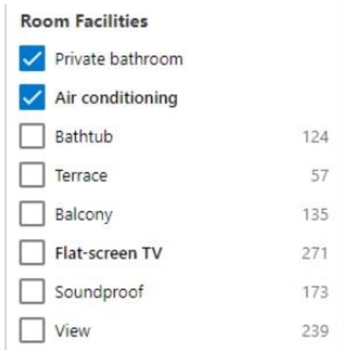
Next, I’m going to do is filter by my preferences…

There are so many options, I can’t fit them all into a screenshot. However, to avoid confusion, the options are organised by category: “Neighbourhood”, “Room Facilities” etc.
I love this feature. I want to be able to filter everything without air con or a private bathroom before I even start to consider rooms – there’s no chance I’m booking them, so getting rid should be made as easy as possible.
Given my preferences (and their suspicious “Top Picks” algorithm, which they don’t disclose) here’s my choice:

In this panel, I can see so much information without even having to click through to view the hotel. I’m given:
- A photo of a room
- Hotel name
- Star rating
- Location
- Type of room
- Type of bed
- Number of rooms available
- Cancellation policy
- Booking rating
- Reviews
- Location rating
- Number of nights and people
- Price
- Breakfast included
- Pre-payment policy
- Airport Taxi info
- And finally, a button to learn more.
Phew.
All of that content in one small box – and yet it’s not cluttered or hard to understand. If this isn’t great content design, then I don’t know what is. I have all of the information I need to inform my next click.
And so I click. I’m greeted by a series of images of the hotel, a detailed description of the place and the surrounding area and, most importantly, the below table showing exactly what I’m getting for my money.
Easy peasy lemon squeezy. I opt for a junior suite because that’s the cheapest and I know that I’m ticking every box before I click to reserve.
So, what does Airbnb have to offer? Let’s run the test again.
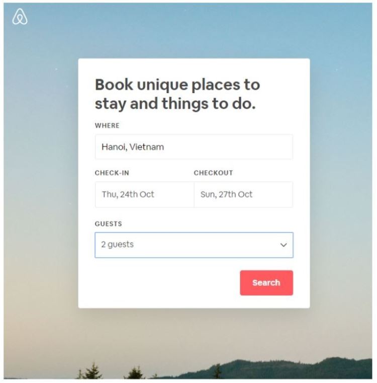
I’m looking for a room in Hanoi…
The initial result shows a list of accommodation in the same non-descript order as Booking. In order to filter the results, we have to find the relevant options under one of six tabs.

So, I’ve managed to select the options for a private room with air-con and breakfast, but only after opening the “show all amenities” menu”.
You can’t filter by area or tourist hotspot like you can on Booking. Instead, Airbnb shows the accommodation on a map – meaning if you’ve never been here before, you’ll need to Google where the Old Quarter is so you be sure to book in the right place.
Here’s my pick, what a bargain:

The listing leads with images followed by user-input data about the accommodation, including the amenities. In order to check the place actually fits my specifications, I have to click on “Full amenities” which opens as a modal (ew).
Even after reading the whole page, I’m still wondering the answer to the below questions that Booking answers on every listing:
- What’s the cancellation policy?
- What are the pre-payment conditions?
- Is this an offer or will this price stick?
- Is VAT included?
- It says “Private room in a bed and breakfast” but also says “entire place” – which one is it?
- What tourist hotspots are nearby?
The booking component is as follows:

All of the basic information is here but it’s nothing compared to the comprehensive table we saw earlier from Booking.
I get that Airbnb is a millennial powerhouse, prioritising imagery and minimalistic design. However, when you’ve lived out of a backpack for three months and you need a place to lay your greasy head, you’re not really bothered about how pretty the website looks. You’re more concerned with how easily you can find what you want.
Functionality and comprehensive content are the top of your priority list.
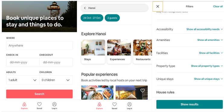
AirBnB’s mobile UX is even more fiddly, slow and unintuitive. Through efforts to promote the “Airbnb Experiences”, the accommodation marketplace has added another step to the booking process before you can actually view the rooms. When it comes to filtering for air-con and a private bathroom, another two clicks are required to access the compressed menu.

By keeping everything as minimal and “neat” as possible, Airbnb is sacrificing UX.
What is great content design?
I’m not saying Booking is perfect, but it’s a darned sight better than Airbnb when it comes to content design. The latter demonstrates a distinct disparity between content and design.
Great content design is having the ability to display the correct information in an accessible manner for all devices. Every click is another chance for the user to lose attention or go elsewhere. A lost customer is more than just one lost sale, it’s a disengaged user who may never use your services again, in favour of your more accessible competitor.
That’s it for today, please feel free to share examples of great content design below, I’d love to see how other industries consider content, UX and accessibility, bringing customers/readers back time and time again.

